Problem Solvers
Crafting practical solutions to real-world product challenges in a single day.
Skills
Category
Client*
Project
*These designs are part of a student project created for educational purposes and are not affiliated with or endorsed by Trainline or Apple.
Goals
Discovery: These projects are inspired by my personal experiences and interactions with product interfaces, focusing on enhancing the overall user experience.
Observation: By identifying and analysing frustrations during use, these projects help sharpen my attention to both effective and ineffective practices in commercial design.
Speed: A key goal of these mini-projects is to develop solutions quickly, emphasising efficiency and adaptability in the design process.
The One-Day Process
1.
Identify
Encounter real-life problems during my interaction with a product.
2.
Clarify
Define exactly what the issue is and how it’s impacting the product.
3.
Solution
Produce a proposed outcome in a one-day turnaround.

Trainline
Project Type
Design
Before
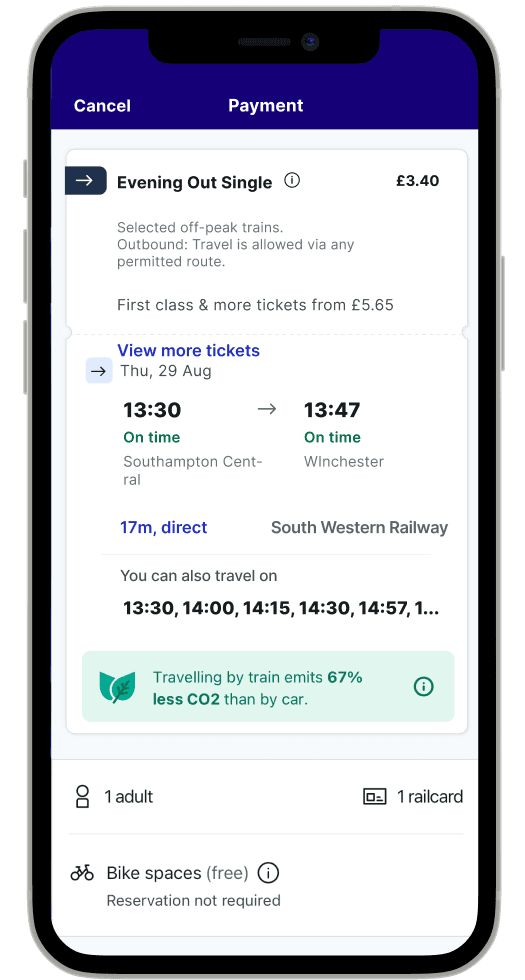
Current Trainline interface when buying a ticket
After
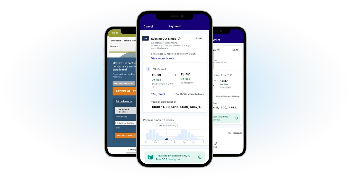
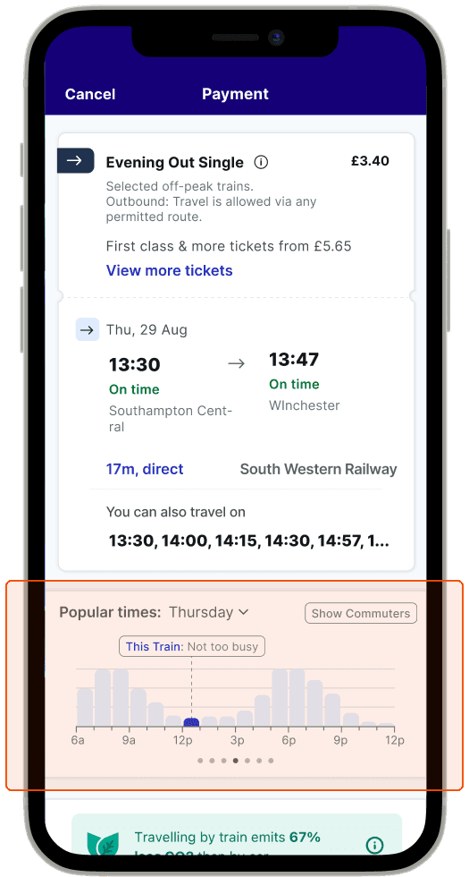
Updated Trainline interface with Busy Times indicator
Problem
Problem
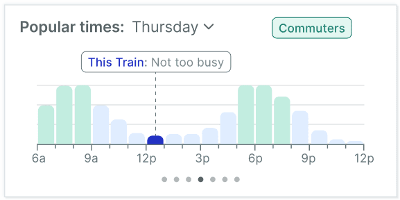
When booking trains, users currently have no way to check how busy their chosen train is expected to be. This can make it difficult to predict crowd levels, especially on unfamiliar routes, such as commuter-heavy lines or peak travel times.
Solution
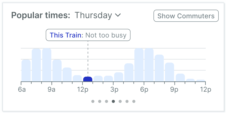
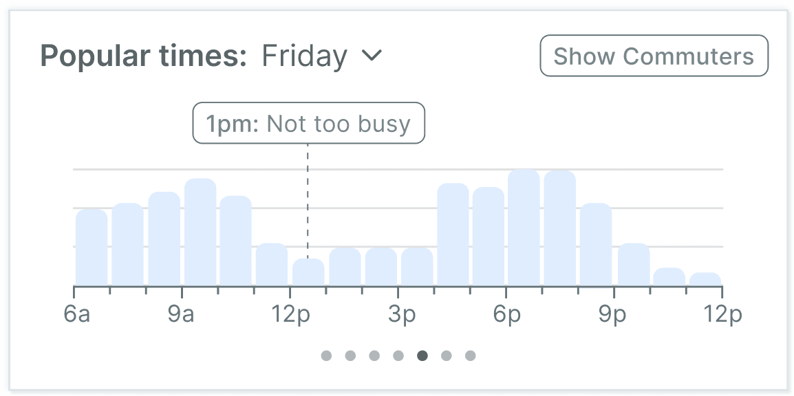
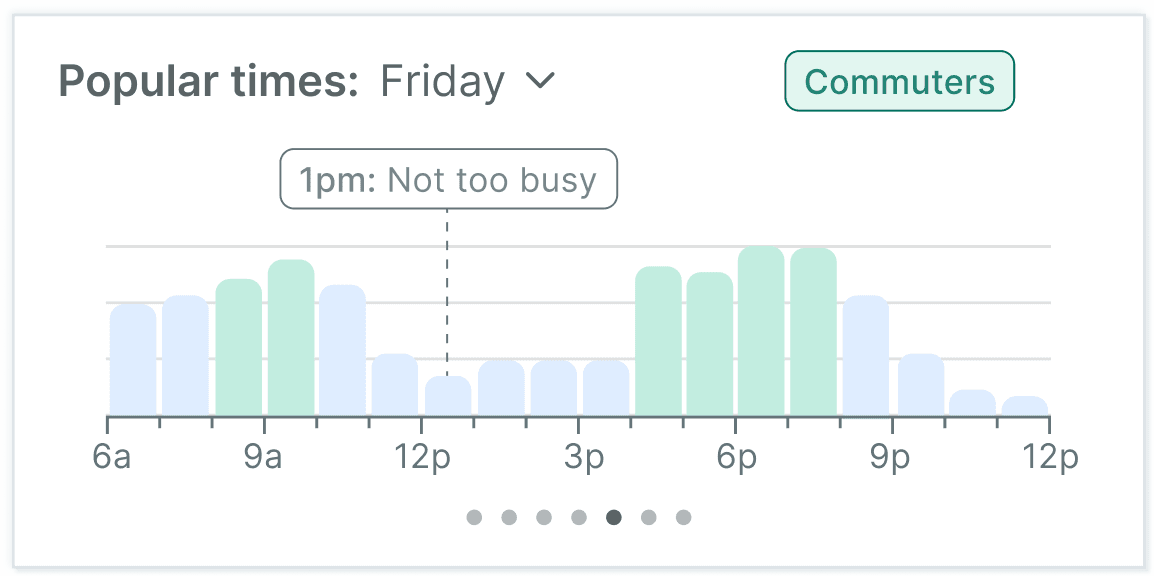
Introduce a dynamic chart that displays the expected busyness of each train before booking. The chart updates based on the selected train and provides insights for the entire day, enabling users to make informed decisions and choose less crowded options.
Inspiration
Google’s Live Popular Times
Proven Utility: Google’s Popular Times feature has demonstrated how visual data on crowd levels can empower users to make informed decisions, inspiring similar functionality to address passenger concerns about train crowding.
Clear and User-Friendly Design: The intuitive and accessible chart format in Popular Times serves as a model for presenting real-time busyness data, making complex information easy to understand at a glance.
Behavioural Insights: By leveraging predictive and live data, Popular Times highlights user preferences and peak usage patterns, providing a strong foundation for applying similar analytics to train travel.
Outcomes
Informed Decision-Making
"Popular Times" section allows users to plan their travel more effectively by choosing less crowded trains, ensuring a more comfortable journey and reducing stress during peak hours.
Enhanced User Experience
Providing real-time or predictive data on train occupancy helps users feel more in control, creating a sense of trust and convenience with the app.
Efficient Crowd Management
By spreading passenger demand more evenly across different trains, the feature can contribute to a smoother transit experience and potentially improve train operations.
Apple Control Center
Project Type
Design
Before
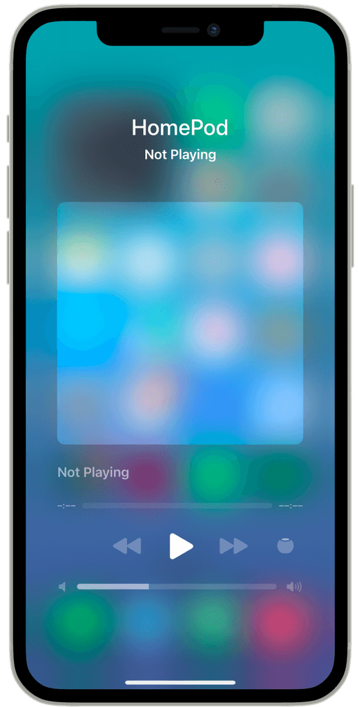
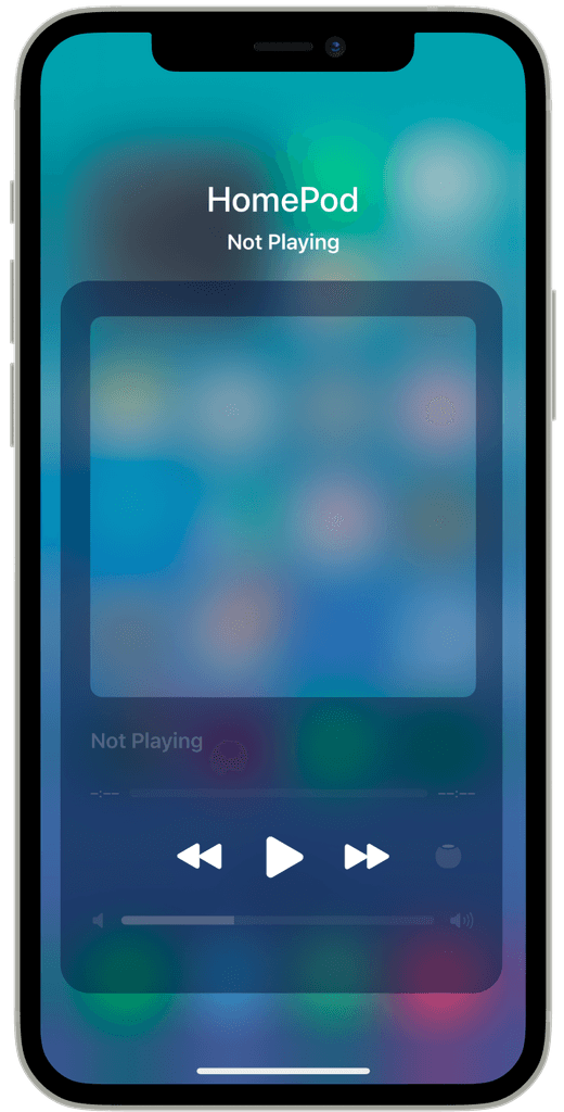
Control Center HomePod interface
After
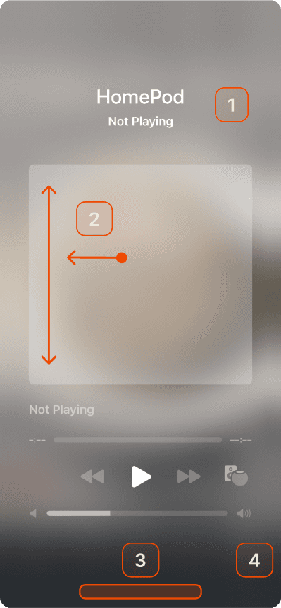
Updated interface with visual cue
Problems
Exiting Tabs
When users enter individual tabs within Apple Home, they encounter difficulty navigating out of the selected tab.
Inconsistent Design
The tab appears as an overlay, but its behaviour deviates from standard navigation patterns used elsewhere in the app.
Confusing Gesture
Inconsistency creates uncertainty about how to exit the tab, leading to frustration and a lack of clarity in returning to the main Apple Home interface.
- Apple Human Interface Guidelines
Inspiration
Apple’s Existing Interface
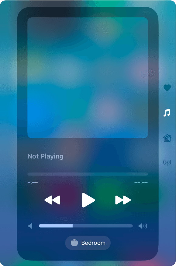
Dark Container as a Visual Cue: In other Apple interfaces within the Control Center, such as the Music section of HomeKit, a dark container over a blurred background signals that tapping outside the container will dismiss the pop-up.
Gesture Expectation: This consistent design establishes an intuitive expectation for users to interact with the background to exit overlays.
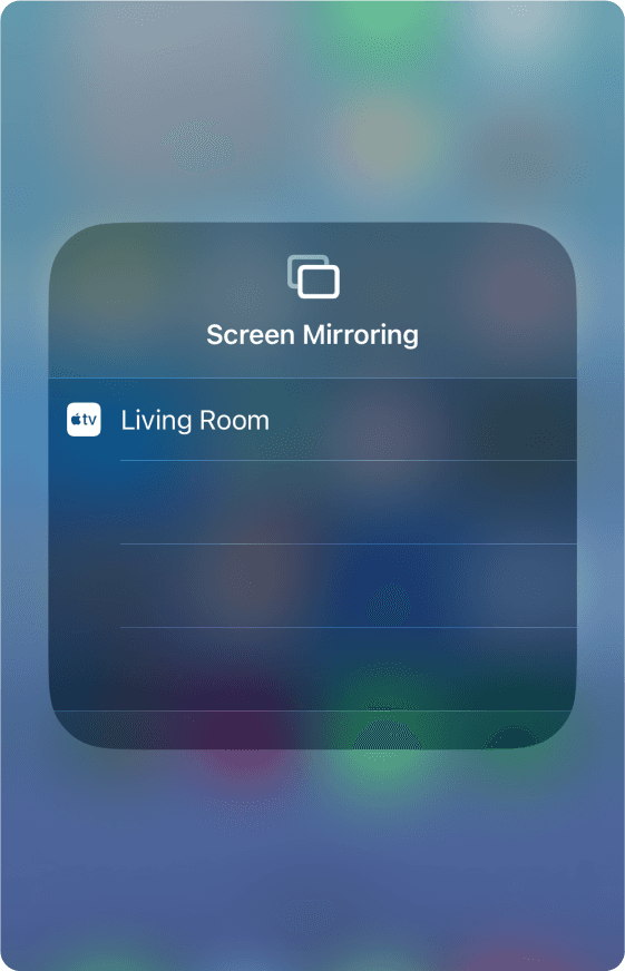
Widespread Usage: This pattern is also used in features like Screen Mirroring and Brightness settings, reinforcing user familiarity and trust in the interaction model.
Control Center: Music
Control Center: Brightness
Control Center: Screen Mirroring
Problem
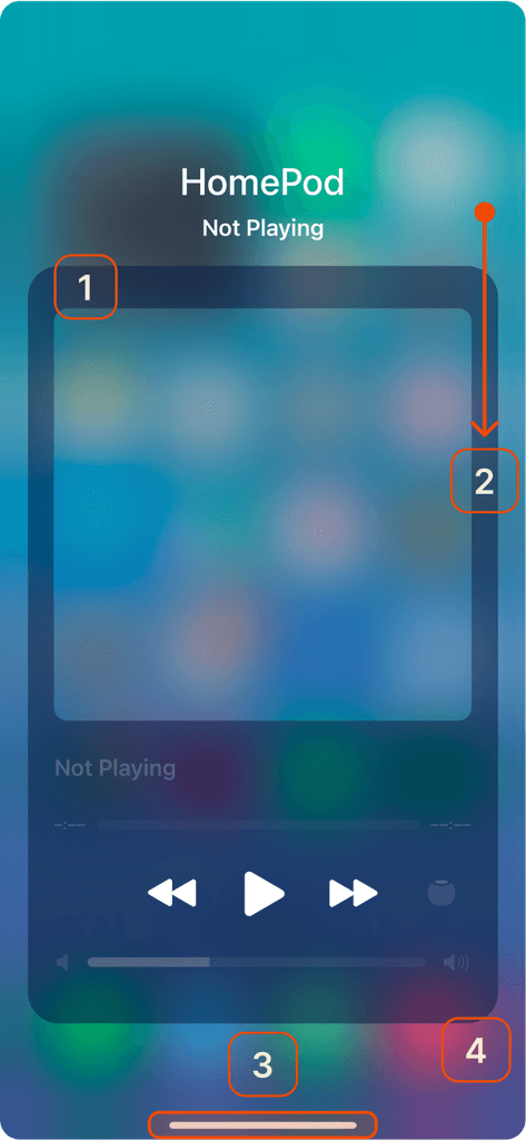
Issues indicated on the existing interface
Lack of Clear Dismissal Cues
The HomePod interface does not include the dark container, leaving users without a visual indicator for tapping the background to exit.
Confusion and Incorrect Gestures
Without the established cue, users attempt alternative gestures like scrolling or swiping, creating unnecessary friction and frustration.
No Apple Home Bar
The absence of the familiar Apple Home Bar further adds to the inconsistency, removing another navigational cue that users rely on in other Apple interfaces.
Break in User Flow
The deviation from familiar patterns disrupts the intuitive experience Apple’s UI is known for.
Solution
Dark Container as a Visual Cue
Incorporate a dark container overlay, similar to other Apple interfaces, to provide a clear visual indicator that tapping the background will dismiss the pop-up.
Align with Familiar Gesture Patterns
Ensure the dismissal gesture aligns with established patterns, such as tapping the background, to meet user expectations and reduce confusion.
Apple Home Bar
Reinstate the white Apple Home Bar at the bottom of the screen to offer a consistent navigational element and signal how users can exit through swiping up.
Maintain Consistency
Using the same design patterns found in features like Screen Mirroring, Brightness settings, and the Music section of HomeKit to create a cohesive and intuitive user experience.
Solutions indicated on the new interface
