Luxury Retailer UX Audit
Skills
UX Research
UI Design
HCD
Industry
e-Commerce
Retail
Client
Studio Eos
Project
16 Weeks,
part-time

Goals
How can we refine the visual design and enhance the UX to reflect the premium nature of a luxury watch brand?
During our discovery call, the client outlined specific UX goals: enhance the product filter system and landing page and resolve broader concerns about the website's visual appeal. My role was to craft a more professional and polished aesthetic while addressing specific UX concerns and tackling usability issues that affected trust and conversion.
Outcomes
The redesign led to a measurable uplift in sales, driven by a mini-design system, improved user flows, and stronger visual consistency.
A strong focus on the mobile experience led to a significant increase in purchases and a higher total order value. By unifying the site’s visual language, the design system now supports scalable growth across both the brand and its digital presence.
+20%
Store Sales
+1.7%
Conversion Rate
+185%
Returning
Customers
*Figures taken from 09 May 2025 to 08 June 2025 - the month following the website re-launch, compared to the previous month.


UX Audit
The Before & After
To kick off the redesign, I conducted a comprehensive UX audit that combined competitor analysis, user insights, and a detailed evaluation of the existing website. This deep dive uncovered critical issues with user flows and UI inconsistency that hindered the overall user experience.
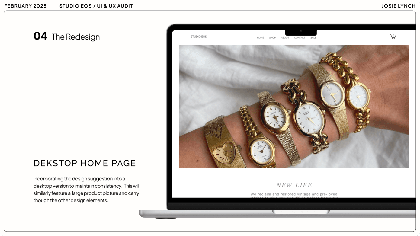
We made a strategic decision to start with the Home Page for the re-design of the website. It was a gateway into analysing the site’s existing UI, and a platform for demonstrating new concepts to the client before applying them across the site.


Home Page - Key Problems
One major issue was a lack of consistency. There were no existing design standards set for any of the UI, including typography, colour, padding, buttons, and input fields. The UX flows contained additional barriers and were missing essential steps for user satisfaction.

Home Page - Key Solutions
I advised using a simple design system to aid consistency across the site, speed of delivery, and continuity of branding. I also proposed further investigation of the UX problems, such as reviewing the mobile check-out and updating the shop filter system.

Client Presentation
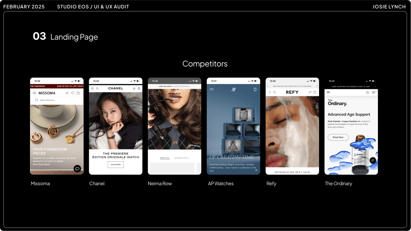
I presented my UX Audit findings to the client, outlining the key usability issues and barriers to improving the existing website. I focused on providing actionable examples of areas where I could improve the design, consolidated the competitor research into clear findings, and set out my strategic proposals for creating a user-focused e-commerce platform.


Defining Project Strategy
Budget and scope limitations defined the parameters of the project strategy, meaning there was limited scope for UX Research. I worked closely with the client to agree that the scope covered competitor research, insights gathering, and the UX website audit to achieve the project goals. This streamlined approach balances time limitations with the desired project outcomes.
01
Brand Strategy
Consolidate the brand identity and strategy into a single set of documentation.
02
Design System
Define a small-scale design system for consistency and scalability that can be handed off to the client.
03
User Flow
Smooth out friction in the key user flows and define proposed solutions.
The Redesign
Strengthening Information Architecture
The original site lacked a solid structural foundation, making navigation unintuitive and incomplete. Key legal and usability requirements were missing. To address this, I created an improved sitemap that introduced essential sections such as policies, terms & conditions, and FAQs. This ensured the site met both user expectations and compliance standards.

Reforming Typography
An initial audit revealed inconsistent typography across the site. I conducted a full typography review, identifying opportunities to bring cohesion and elegance to the brand’s visual identity. I selected refined, slim typefaces that reflect the luxury market and implemented a responsive type scale to support legibility across devices.

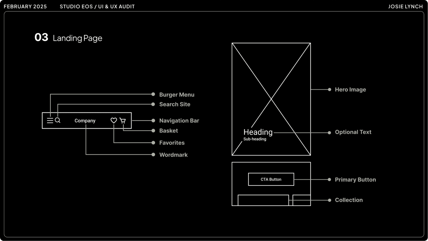
Setting UI Standards
UI consistency is essential for a good user experience through recognition and patterns of interaction. The existing website needed a UI overhaul to align existing components to brand standards and design system consistency. The existing button components were replaced with simple monochromatic primary and secondary buttons to align with market competitors in the luxury beauty industry. These updates laid the groundwork for a scalable design system.


Refining Key User Flows
Using insights from user feedback, competitor analysis, and best practices, I redesigned the product filter to improve clarity and reduce friction. The new filter features clearly defined product groups, concise UX writing, and a more intuitive hierarchy, making product discovery seamless on mobile.

Outcomes
User Testing
Due to budget constraints, we prioritised testing post-launch to validate key design decisions.
While we couldn’t run early-stage usability tests for every feature, we focused our efforts on targeted A/B testing for the redesigned UI and core user flows. The results were clear:
Users consistently preferred the new visual style and reported a smoother, more intuitive experience.
They successfully used the updated product filters to find items faster.
Users completed the checkout process with minimal friction.
These outcomes confirmed that our design changes addressed real user pain points and improved the overall experience.
100%
Preferred the new design
75%
Successfully filtered
for their desired product
4/4
Completed Checkout
Concluding the Project
01
Deployed a test site and conducted a thorough review to identify and resolve any final issues.
02
Launched the redesigned website in May 2025, with no errors reported.
03
Held a post-launch meeting with the client to close out the project, review outcomes, and transfer all design assets.
04
Monitored site performance during the first week to track user behaviour and confirm stability.
Project Reflections
Looking back on the project, I’m proud of both the design outcomes and the impact on the business. The process reinforced several key lessons that I’ll carry into future work:
Establish project parameters early to align expectations and scope from the start
Advocate for deeper user research and communicate its long-term value
Learn how to balance time constraints with quality outcomes
Document design decisions early to support collaboration and future iteration
Since the site launched, the business has seen significant success:
Achieved its highest one-day sales record
Sold its highest-value single item to date
Saw an increase in conversion rate
Improved average weekly sales
Increased average order value
These results came from a strong partnership with the business owner, a disciplined approach to scope and budget, and a user-centred design process that guided every decision.